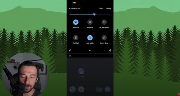
Yo how’d our hommie sideofburritos get old school quick access on GrapheneOS? Is this just an old version? The video’s only a year old! So I’m on GOS Android 13 (aka big dumb quick access button purgatory), totally confused and totally jealous. I can only imagine an out of touch board testing a new android version and telling the developers to make the buttons bigger and dumber while they tell their managers “okay, we can do that” while they die a little inside. This is the most egregious design offense committed in the history of AOSP.
Please tell me this can be fixed with System UI Tuner or some other bullshit that doesn’t kill my battery life or privacy.
A place to discuss privacy and freedom in the digital world.
Privacy has become a very important issue in modern society, with companies and governments constantly abusing their power, more and more people are waking up to the importance of digital privacy.
In this community everyone is welcome to post links and discuss topics related to privacy.
Some Rules
- Posting a link to a website containing tracking isn’t great, if contents of the website are behind a paywall maybe copy them into the post
- Don’t promote proprietary software
- Try to keep things on topic
- If you have a question, please try searching for previous discussions, maybe it has already been answered
- Reposts are fine, but should have at least a couple of weeks in between so that the post can reach a new audience
- Be nice :)
Related communities
much thanks to @gary_host_laptop for the logo design :)
- 0 users online
- 108 users / day
- 435 users / week
- 1.32K users / month
- 4.54K users / 6 months
- 1 subscriber
- 4.62K Posts
- 116K Comments
- Modlog


Are you saying you like the big buttons? Because Android 12 is when they were introduced.
No oops, I hate it. I think Android 11 was it when it was just working.
I liked the small circular QS buttons best from everything they’ve put out so far. If they brought those back and had an option to remove the button titles, I’d be happy.
I do like them
I’m confused. Quick access was introduced in Android 4 and those buttons were huge.
Sorry, Android 12 added the new Quick Setting tile called “Internet” that combined the Wi-Fi and Mobile Data tiles. Yeah you’re right, I had big square QS buttons on my old Galaxy S4 but when I switched to Pixel it had the small circular buttons for a short period.
[This comment has been deleted by an automated system]
Gosh, yeah. I vaguely remember having a custom ROM for my ZTE Blade which gave me quick access icons. Seem to recall I could display certain widgets there, too.
yeah I do and Im tired of pretending I dont